How to make a rigid presentation box

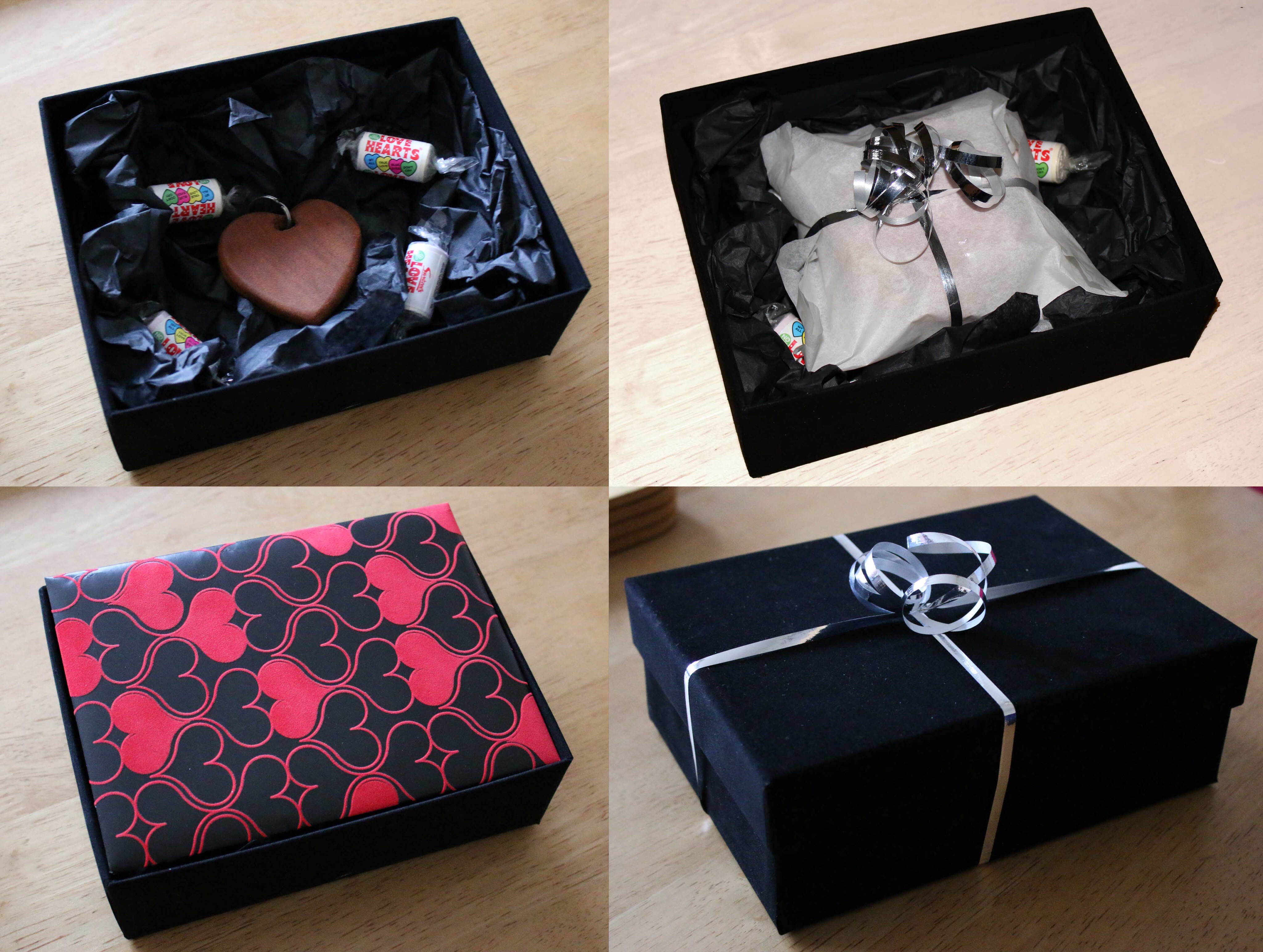
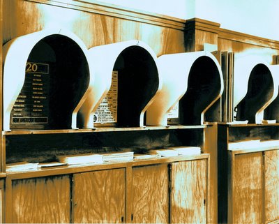
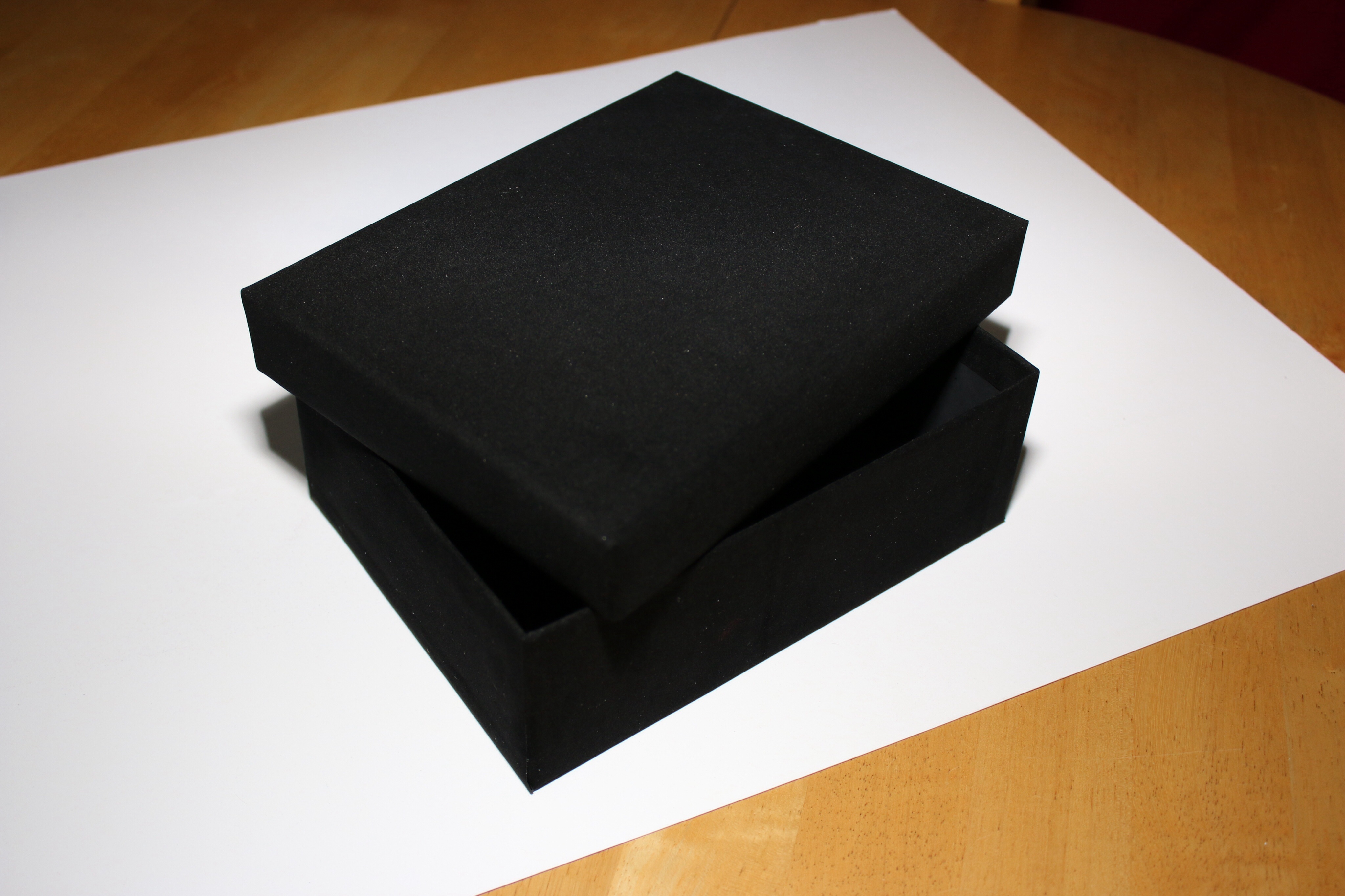
In preparation for Valentine’s day, and as I’ve been stuck at home for the week, I thought I’d make a rigid box to go with a home made gift I was planning.

Although readily available from the shops these days, making your own can mean you can be flexible with materials, colours and sizes and will make the difference between a cobbled together design and something that looks like a gift to be kept.

Talking to traditional box makers, you’d think it was a dark art, but following some basic tips and a bit of practice, it can be a satisfying way to add a bit of luxury to your home made gift.

What do you need?

Things you need

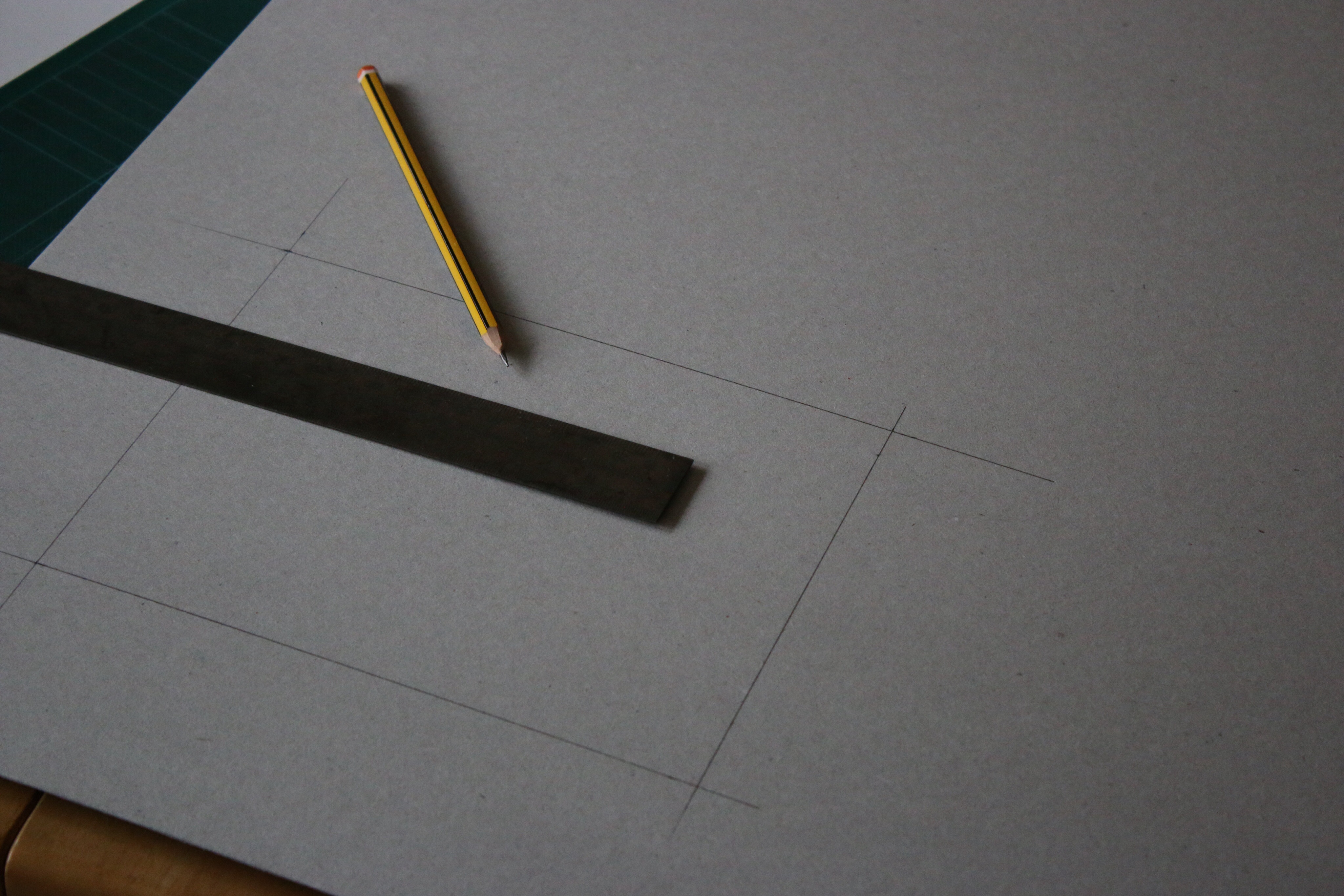
All the tools can be found at your local craft shop or DIY store and are as follows:

Tools

  • A sharp blade, I prefer a scalpel but a craft knife would work.
  • Steel measuring rule
  • A sharpened pencil
  • Masking tape (this needs to be the paper type)
  • Adhesive. A strong spray mount can work well but make sure you have a ventilated area (or the garden) close to where your working.
  • A firm surface to work on (I’m working on the dining table with a cutting mat to protect the surface)

Materials

  • A sheet of Rigid pulp board: I’m using a grey board which has a black coating on one side. The material needs to be between 1 & 2mm thick (1000-2000mic or 0.04-0.08″). One side of the board will be visible on the inside, so you can coat this or use a coloured or pre-coated material as I am, but these boards can be expensive so a solid grey or display board can also be used.
  • A covering material: I’m cheating by using self adhesive material, but any substantial paper such as wrapping paper works well. You don’t want to be able to see through it and the adhesive needs to stick well, so this may need some experimenting, but if it’s paper on the inside, and not too thick, you can’t go far wrong.

The Method

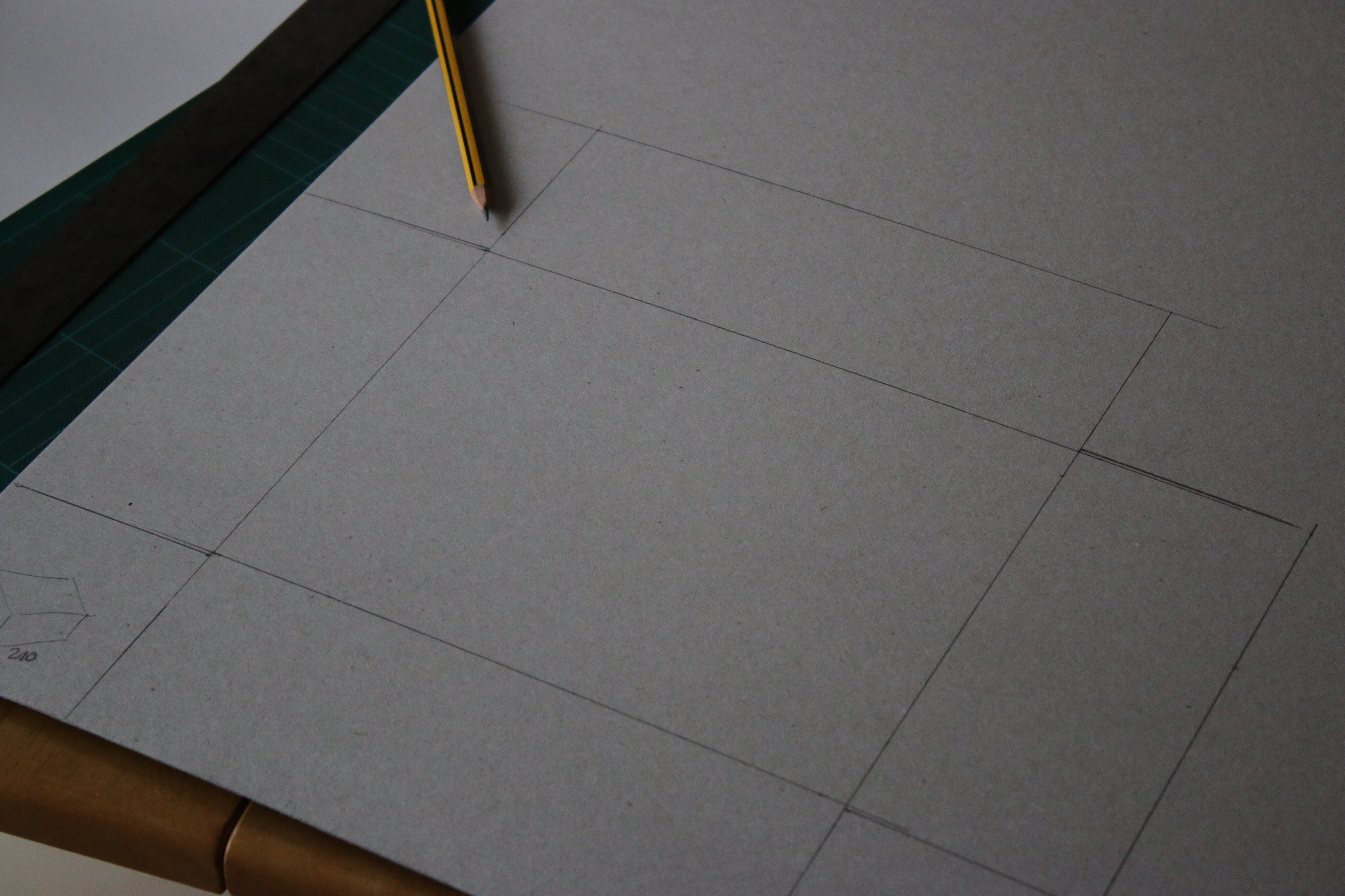
Step 1: measure the base.

I like to use the edge of the board to keep my lines square. Start by drawing the base panel offset from the edges by the depth of the box.

the side that we’re drawing onto will become the outside of the box, so if you have a coated side, make sure this is face down.

Marking up the base
Marking up the base

Step 2: Measure the sides

The long sides of the box are the same length as the base, so just extend these lines out from your base. The short sides need to be stepped outwards by the material thickness. For me this is 1.5mm, and this allows the material to overlap in the corners. Extend and join the lines to form a cross shape.

Marking the side panels

Step 3: Cut out the board panel.

All the outer lines including the short (1.5mm) step should be cut through. The 4 lines making up the base panel need to be scored half way through. This takes a bit of practice but I would suggest several gentle strokes testing each time. If you’ve cut through far enough, the panel should fold neatly. Be careful not to cut too far through as the corners will be too weak.

Cutting and scoring
Cutting and scoring

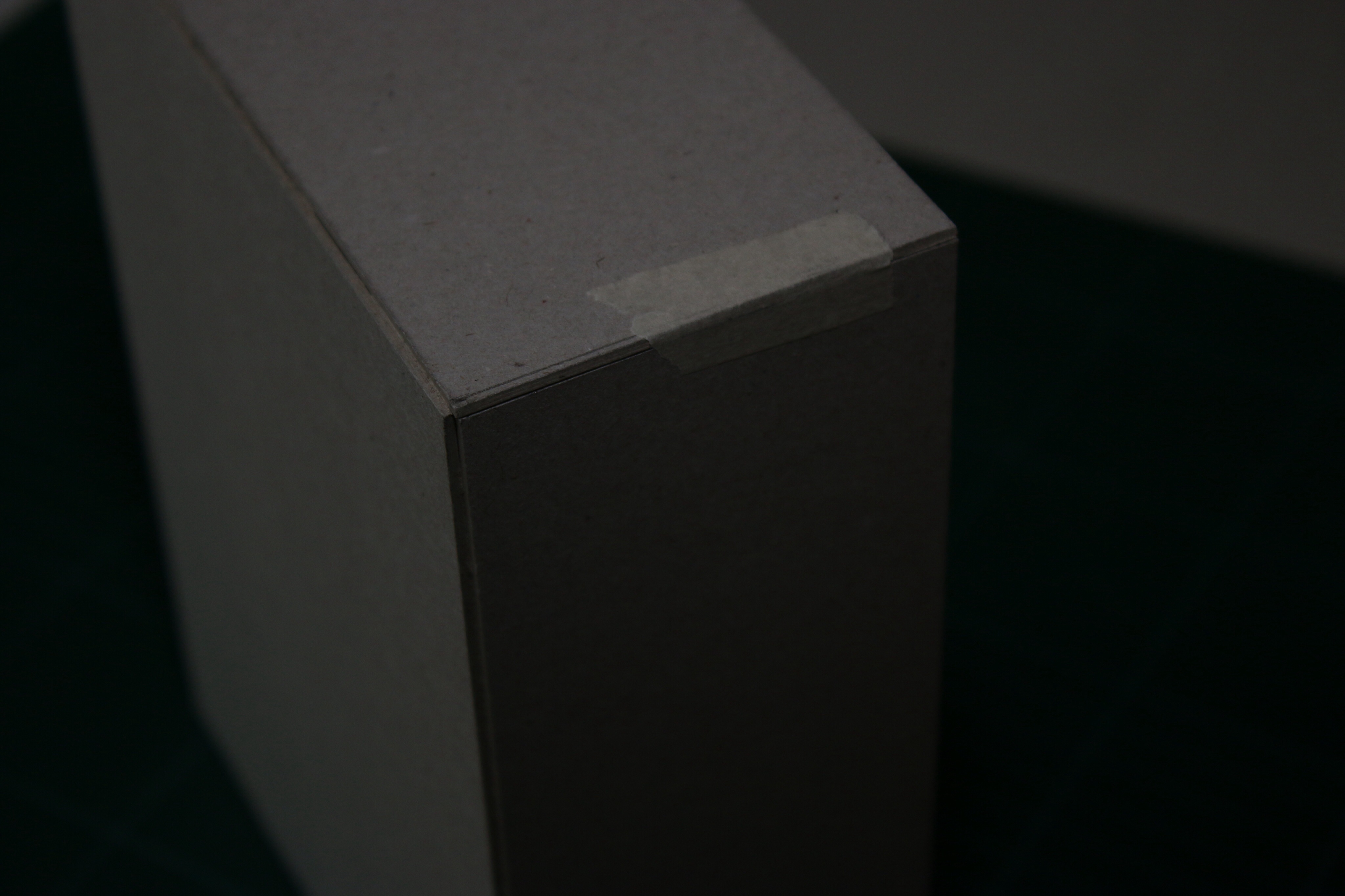
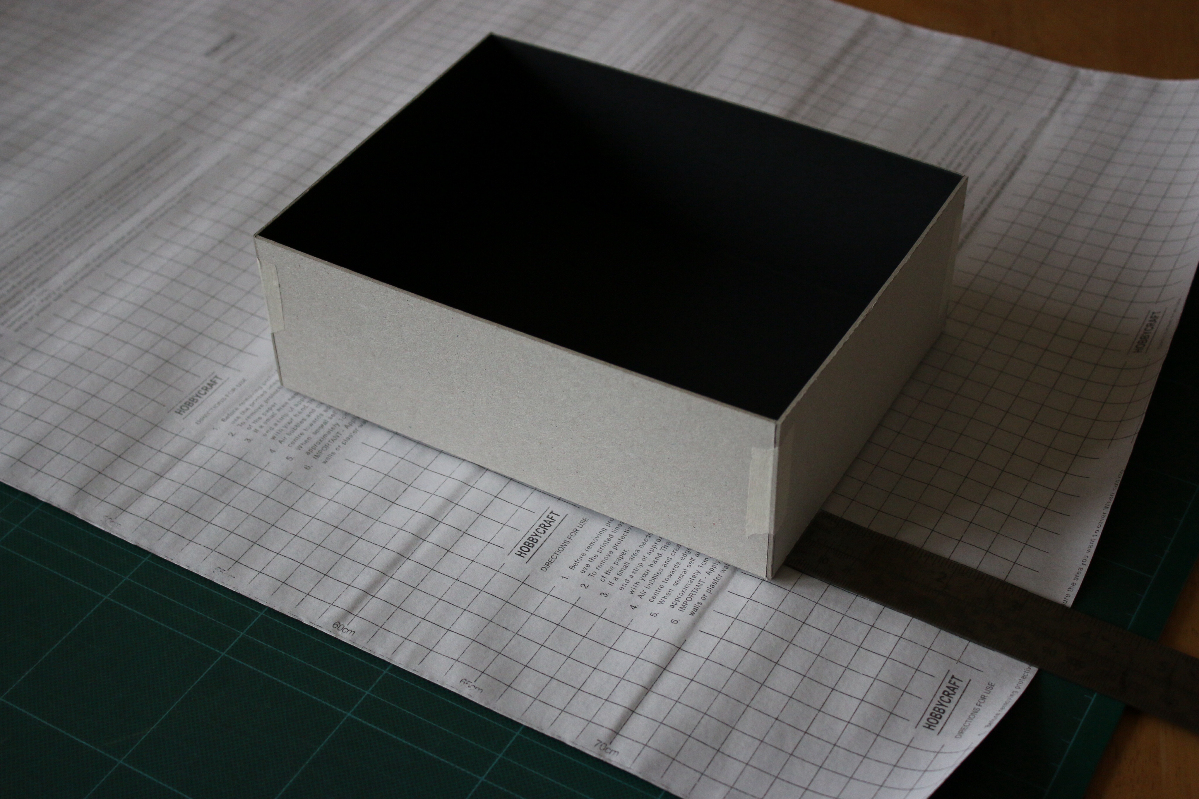
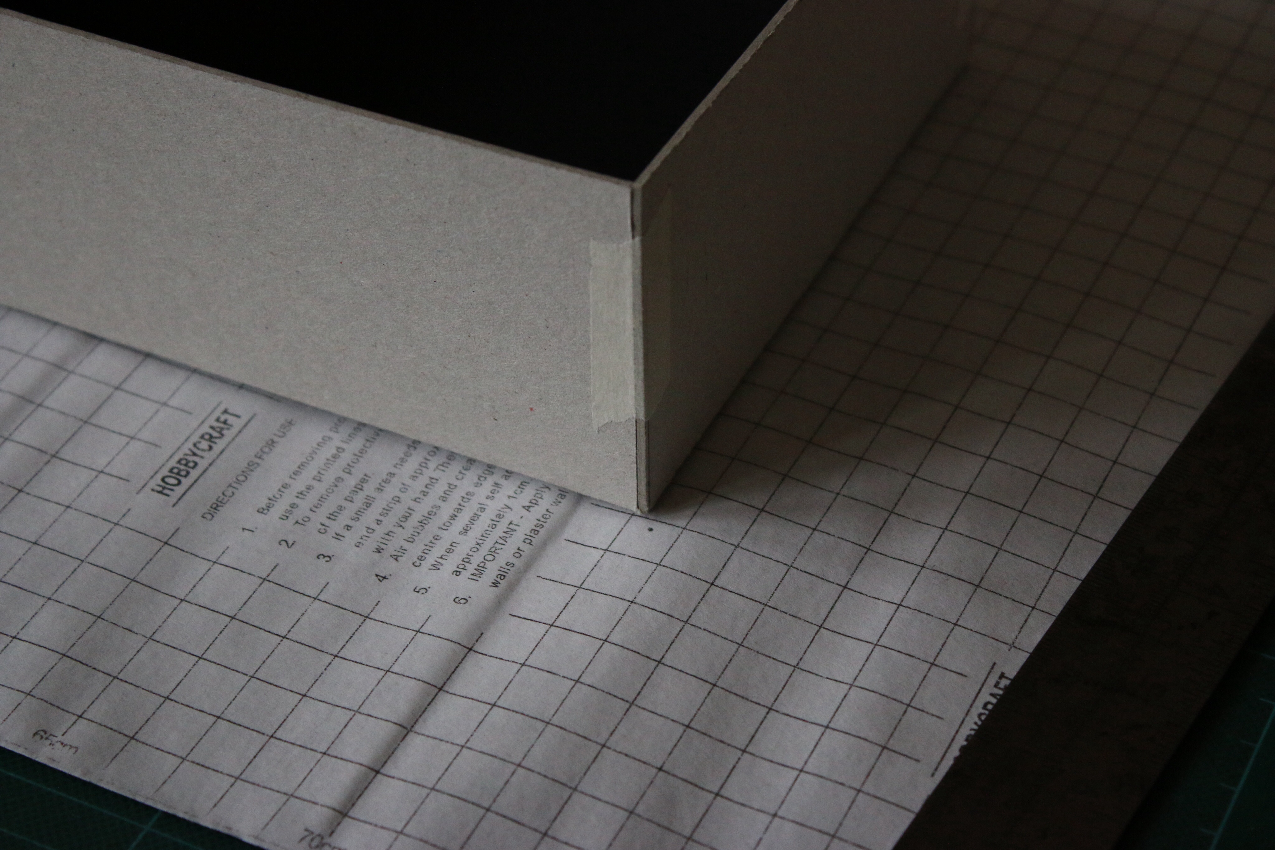
Step 4: Forming the box

Taking some neat lengths of masking tape, fold up the sides and join them together like a but joint with the shot edges overlapping the long edges. This will form the main structure of the box so it’s important that the tape is firmly stuck.

Taping the corners
Taping the corners

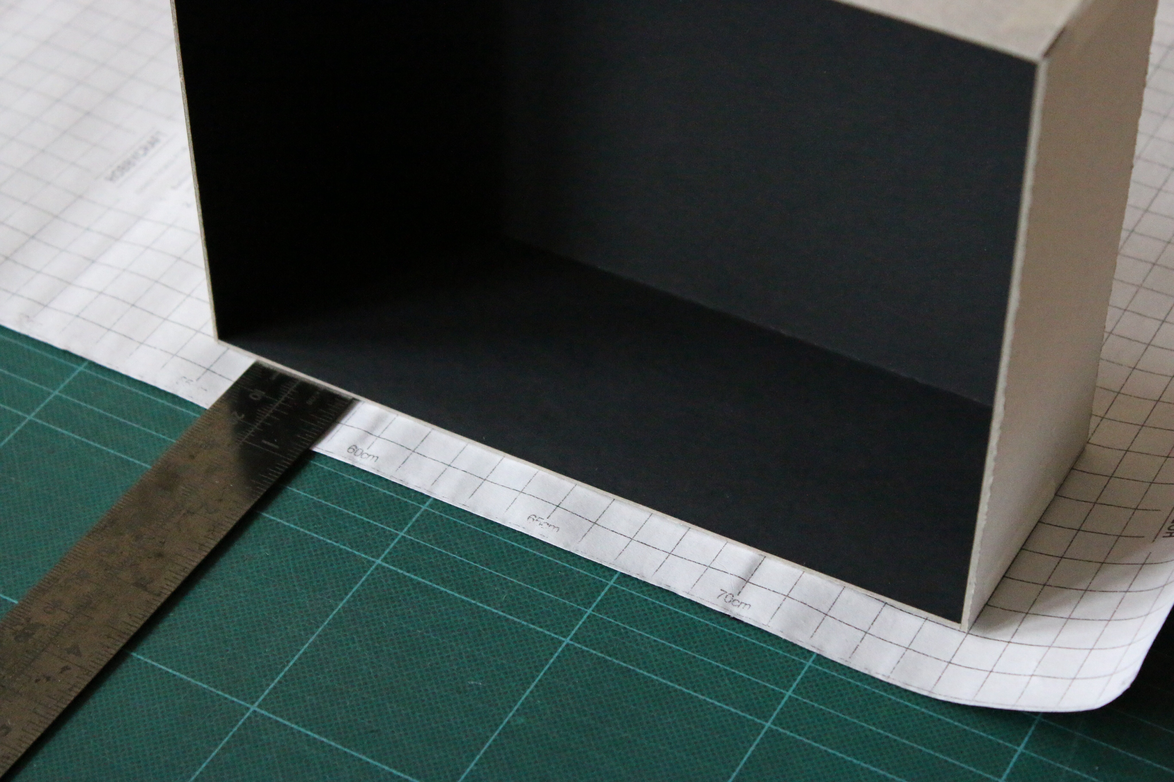
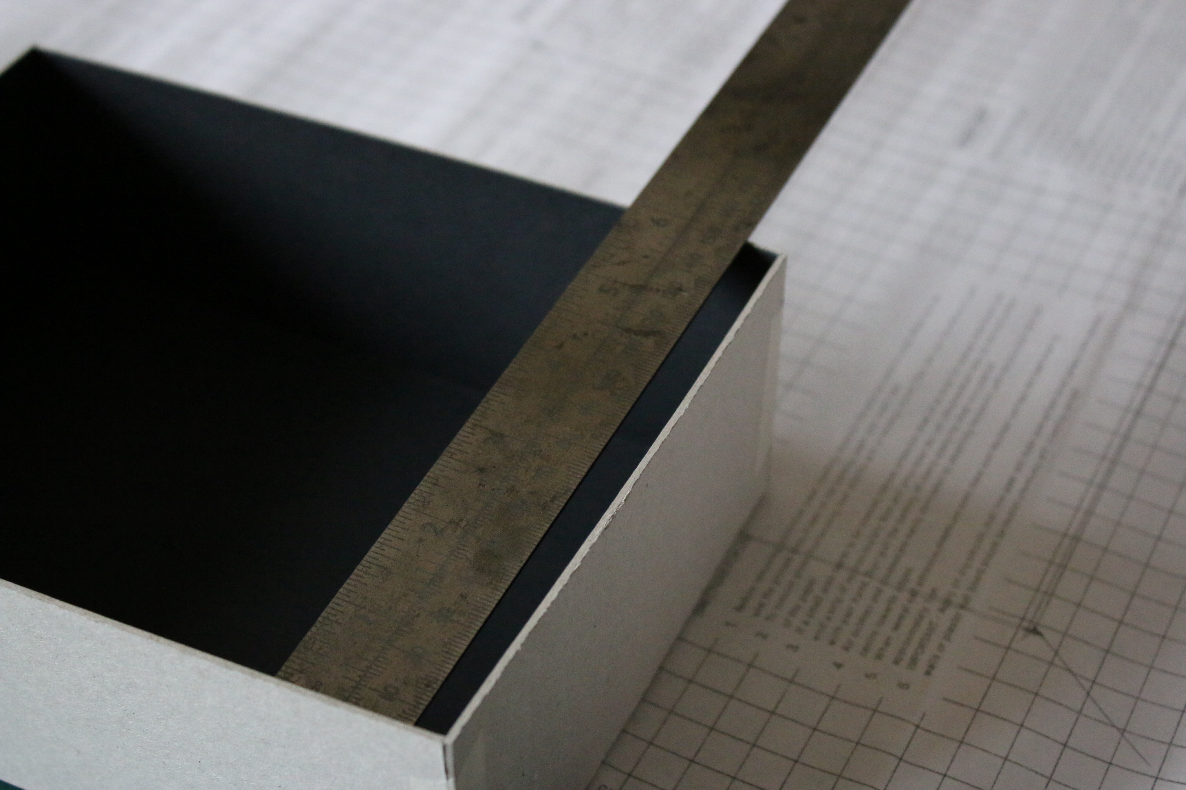
Step 5: Mark the covering position.

The covering needs to fold over the edges onto the inside by about 15mm (1/2″). Normally I’d draw this out on the CAD table but if you use the made up box as a guide, this is not too difficult to draw by hand. I have a grid on the backing paper of my covering which helps to ensure it’s square, but using the edge of the material (and careful measuring) works too. Using a ruler, position the box 15mm from your starting edge, then roll it over so that it is sat on its base. Measure the distance from the edge and position the box the same distance from the short edge.

Measure the turn in
Measure the turn in
Position the box 1
Position the box 1
Position the box 2
Position the box 2

Step 6: Mark the corners

place a dot at 45 degrees out from each corner, about material thickness away from the box. This will be the starting point for our layout and will help us re-position the box later.

Marking the corners
Marking the corners

Step7: Drawing the wrap outline.

From these dots, we’re going to create a kind of cross shape with some extra flaps to make it neat.

Start by joining the dots to form a rectangle. Then mark diagonal lines outwards from each corner about 25mm (1″) long. The long sides of the paper, will wrap up and around the corners onto the short edges by about 15-20mm. The diagonal lines form the start of these new flaps.

Using the outer flap distance you measured before, draw the outer edges of the wrap by creating a rectangle equi-distant from the base rectangle.

You can now form the long sides of the box by drawing vertical lines offset by 20mm and meeting the diagonal lines towards the middle.

Drawing the wrap
Drawing the wrap

The short sides need to be cut in from the corners, so that they can fold over neatly inside the box. Measure the inside dimension using the measuring rule and draw parallel lines offset from the base panel and extended outwards towards the outer rectangle. At the corners draw a V shape so that these parallel lines meet the diagonals of the long edges at a point.

Measuring the short inner edge

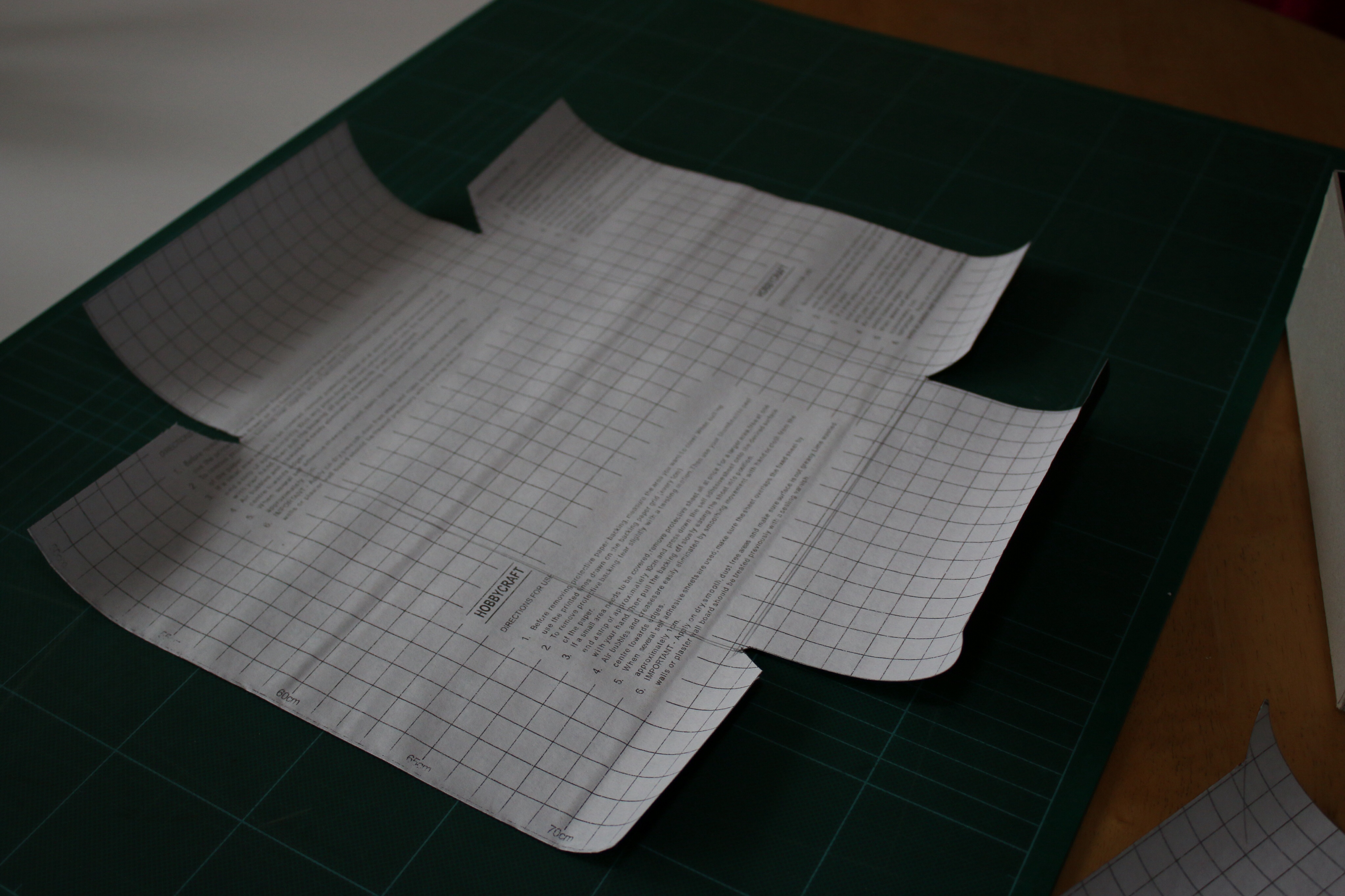
Step 8: cut out the wrap.

Using the ruler and following the lines you have drawn, carefully cut the wrap. You may need to change the blade to make sure you have a neat edge. You will be left with a shape like this:

cut the outer wrap
cut the outer wrap

Step 9: apply the adhesive

if like me you’re using self adhesive material, carefully remove the backing. You may find the material is a bit curly so perhaps leave it under some books for a while first to stop it sticking to itself. If you’re using spray adhesive, you need to be quick here. It’s important to apply a good even coat, but note that the glue starts to set off quickly so read through the next steps carefully and maybe practice first as it is important to make up the rest of the box before the glue dries.

Step 10: Position the box

Position the box
Position the box

Place the glued wrap face down on the surface so that the glued side is up. By aligning the corners of the box with the V shapes you made, carefully and firmly press the box down onto the wrap. Quickly check and smooth any bubbles out, and place back down.

Step 11: Fold up the long edges

Start by pulling the centre of the long edge upwards tightly then using your other hand smooth the wrap outwards towards the edges to ensure there are no ripples. Fold the angled tabs around the corners and press down firmly. Repeat for both sides.

Fold up the long edges

Step 12: fold down the turn-ins

Next you need to fold the turn ins down. I like to make a short upwards cut in the corners to make this easier, especially with thicker materials as it relieves the pressure. Start by folding the corners down, then move to the middle and press outwards. You will need to be firm to make sure the adhesive sticks and that the corners are neat. Repeat for both sides.

Folding the corners
Folding the corners
Folding the turn-in
Folding the turn-in

Step 13: Fold up the short edges

Now the short edges can fold up and over and cover all the tabs. Work from the middle outwards as before and press the turn-in down firmly.  The cut back that we drew earlier should ensure that you have a nice even seam at the corners. Repeat for both sides.

Finished corner edge

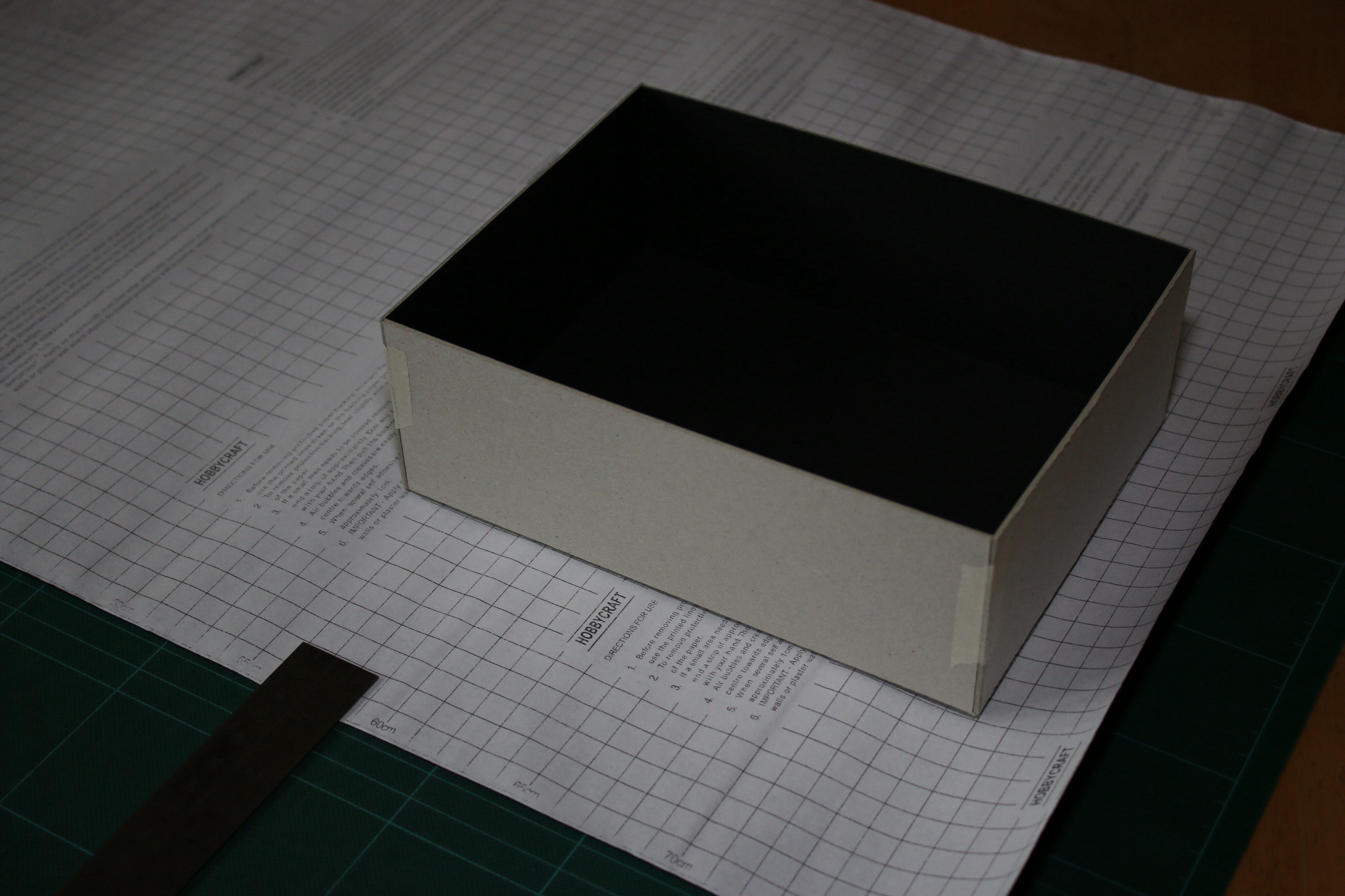
Step 14: making the lid

The lid is exactly the same and follows the same steps as before. This is where you can get creative. I’ve chosen a short height lid like a shoe box of about 30mm deep, remember that the base panel of the lid needs to be bigger than the base box, so measure the outside dimensions and add a bit of room for friction (a millimetre or two) to each side. If you want the lid to be full height, use the same depth as the base. You can also try contrasting colours or prints, ribbons or filling materials. I went fairly plain as I was limited to what I had in the cupboard, but the materials available these days mean you can create some really nice effects.


Finished box and lid

…most of all have fun!

Valentines gift packaging

The Decline of Physical Media – a self fulfilling prophecy?

From my frame of reference as a packaging designer, I’ve had a fairly close connection with the media and home entertainment (HE) industry for several years now. I have always been a keen music lover both as an amateur performer and avid collector. It is with this in mind along with the recent news of the impending HMV administration that I thought I’d express some of my concerns about the state and future of physical media.

HMV

It was at a recent National Trust visit that I realised how far the heritage and familiar logo of HMV (His Master’s Voice) spans. As purveyors of music playing devices since 1899, the Gramophone company opened a music shop in London in 1921. Following acquisition by RCA, HMV were also instrumental in building well known brands such as EMI and JVC in the 60’s and 70’s.

Aside from continued growth during the 90’s and some unsuccessful attempts at innovation, I witnessed, along with everyone of my generation a much more rapid decline in the availability of music in disc format over the coming years.

After a sales peak in 2001 fuelled by the popularity of CDs – and as my music buying appetite began to flourish, there grew an air of doom and gloom across the industry as talk of piracy and internet downloads (and of course supermarkets) threatened physical sales. Not constrained to music, film, TV and games also felt the impact of internet technologies. Although difficult to identify, I wonder how much of this decline was due to demand and how much was availability against convenience?

Record Shop

In my parents’ generation, going to the music store was an event. My Mum will recount stories of travelling with her mates into the local record shop to listen to music, grab a milkshake or coffee and choose albums to take home. Even as I was growing up, I had a wide variety of choice – Tower Records, Our Price, Virgin Megastore, I would travel into the city and spend 4-5 hours listening to the ever diminishing vinyl sections and be really proud of myself when I found a great record before it became popular through radio airplay. As time went on, and the internet age overtook, Vinyls and listening stations vanished from the high street to be replaced with everything from clothes to fruit-bars to headphones. A modern HMV store would struggle to boast more than 25% of floor space devoted to music. So even as a committed fan of the shopping experience, I find it increasingly difficult to satisfy my (admittedly eclectic) taste.

listening booth

If I talk to a marketer from any other industry sector they would start by telling me that one of the key motivators of their trade is buyer behaviour. Although there is now a generation of consumers who have never experienced the listening booth, I’m not sure their needs are any different to mine – I buy music over the internet too, in fact I purchase through several channels – music on subscription, music downloads, physical media purchase through the internet and shopping in store. I listen to the radio for recommendations, I also like the ‘listen’ buttons on websites – and my favourite feature of internet shopping is the “you might like this” suggestions. These features used to be available in-store although I fear that this added value and personal touch was too difficult to quantify against sales in a demanding retail environment. What I am very sad to have lost through internet shopping is the additional content, the artwork, booklets and inserts (and obviously packaging) which for me was very much a part of the whole purchase experience.

sgt peppers lonely hearts club band

With its self-fulfilling prophecy, I worry that the music industry and HE sector in general has lost sight of what’s important for the consumer. I will personally be very sad to see the demise of music on the high street, and would love to see a wave of innovation which sets to improve the terrible audible quality that people seem to tolerate for convenience sake. For now, however, I leave you with some hope that I will at least cling on to:

2012 Vinyl Sales grew by 39% in the UK (similar figures reflected in US) – about 15x growth since 1993
Digital downloads reflect less than 1/3rd of all album sales
Even with a 13-14% decline in sales last year – we bought 43.6 million CDs in the UK (86 million US)

Even in the high turnaround, impersonal world of modern music, our appetite is greater than ever.
Provided the industry pulls itself back together and re-invigorates its focus, I am optimistic for the future of physical media.

Why is Packaging Important?

I recently read a book (Ready Player One) in which the lead character became absorbed into a matrix style online gaming world which he felt was better than the “real” world around him. A world of warcraft style adventure ensued as they battled to win a prize to inherit their digital world from its inventor after his death.

Even in this fantasy world of a digital tomorrow, the character had to order his food and hardware to be delivered or collected from an outlet or storage.

I am normally a strong advocate for independent retail and the high street. It pains me to admit, however, that this year I purchased about 90% of christmas presents online. (though 2 gifts haven’t arrived in time which strengthens my argument)

This year (2012) online shopping is expected to reach nearly 10% of all retail spending in the UK and is growing quickly with almost two thirds of adults reported to make online purchases. [www.huffintonpost.co.uk, www.telegraph.co.uk ]

Even in the world of online, we still need Things and things need packaging.

Apart from the career it has developed, to me packaging is important for several reasons:

Product protection.

  • Cucumbers last three times as long on the shelf when shrink wrapped, which increases shelf life and therefore reduces food waste.
  • Good glassware packaging can reduce transit damage to almost 0%

Cucumber

Storage

  • For a retailer, liquids and grain would be much more expensive to distribute without convenient packaging.
  • Also as a method of preserving. Tins were developed between 1810 and 1813 to improve shelf life – It’s hard to imagine life without this type of packaging.

Tin Can

Communication.

  • For a brand owner, packaging can communicate a product benefits
  • For the consumer it can help make purchase decisions.
  • Packaging is also a great way to communicate environmental or ethical status e.g. ‘fair trade’ or ‘recyclable’

Can Communication

Product Extension

  • A container can be a way for the consumer to identify and interact with the product for example a shampoo bottle.
  • Packaging can also become a product in itself for example gift packaging where a collector will keep the packaging both for storage and as a keepsake.

Bottles

By carefully choosing the correct materials and production methods, not only can we reduce cost and environmental impact of the packaging, we can also reduce waste (e.g. food or perishable goods) improve consumer choice and increase the value of the finished product.

The type of project I enjoy working on the most is gift packaging. The sense of satisfaction when creating a design which will be kept and cherished, rather than disposed of, offers a much greater sense of reward.

Cohesive Packaging Design

These days, you don’t have to look far to find a blog about packaging design. There seem to be hundreds of people from various walks of life giving their top tips about how to create great packaging. Living in the world of 2D, it is easy to forget the stuff that makes the packaging. Many designers aren’t aware of the constraints or capabilities in manufacturing and find it difficult to look beyond the on-screen graphical representation.

Packaging is a tangible thing which you can pick up, hold and open. I wanted to talk about this; the assembled bones and flesh that make up the creative design in the real world. It’s important that all the elements of a design are considered together. The way they interact, look and feel is as important as the pictures and type placed upon them. I have always believed that it is the little details that make a big difference. A minor change can really affect the overall feel of the end result. If, when developing an idea, the designer (or project manager) considers all the following elements, the end result will be a truly cohesive packaging design:

but before I start…

…I realised, while writing, that each element could independently become a huge topic, so over the coming weeks I will start to expand on these component parts along with several sub-headings which have evolved in my notes. In the meantime, however, I will try to summarize as a pre-cursor.

Shape or Structure

The shape is important for many reasons; identification, style, size, mechanics of storage and display. The shape can also determine the ease at which the product is dispensed. Structure for me is the method by which the shape is constructed. Whether it’s the position of a seam line or method of opening, a simple change can be the difference between nice clean lines or low-cost alternative.

Materials

From cost to weight ratio, strength and security through to nice ‘touchy feeliness,’ the substrate plays a huge part in the final result. Carefully choosing materials which complement the design in a consistent way can really help the final message. In dealing with large global projects, the availability and environmental impact of the material is also a really important consideration. Poorly managed choices can adversely affect brand consistency, corporate image and cost.

Print Method

Whether a single colour flexo identity stamp or a complex gravure security label, the method by which we apply our text and graphics (although somewhat determined by material and volume) can help ensure our artwork is presented as intended. Rather than making a compromise because of supply constraints, by understanding the benefits and performance of each technique, we can apply our artwork both effectively and efficiently.

Finishes & Techniques

After print comes ‘finishing.’ The generic term for what might be described as the final enhancement. From in-tool embossing to glitter varnish, these enchanting augmentations can easily lead to a garish tackiness if badly executed. With careful consideration, however, they can also be the little detail that you can’t quite put your finger on; an indefinable quality.

Present Packaging for Puerile Pastime

We may not behave as such, but my brothers and I are technically adult. Our tastes and projections of one-anothers’ wants have accordingly matured in a similarly mundane manner.

During our younger years, the unknowing exited surprise of an unwrapping experience was difficult to contain. It has slowly become the centerpiece to our nostalgic (and somewhat exaggerated) storytelling.

As we have grown older, through a combination of inherent intuition and fear of disappointment, we tend towards the safer “is-there-anything-you-need” options.

One recent Christmas, my youngest sibling (perhaps slightly drunkenly) proclaimed “It’s not the same any more, I’m not sure I can get excited about clothes.” he continued to remark that the presents we acquire as adults (although gratefully received) cannot be ‘played with’ or enjoyed as the toys or games we looked forward to as children.

The problem therefore is this:

How can we be sure that the gift is useful and not superfluous while;
a) ensuring that the opening experience is exciting and
b) satisfying our curiously competitive creative nature?

The solution follows:

created by Liz

Why I like making Pop-ups

I love my job, but It has to be said that having to explain what it is that I do to everyone I meet, can become tedious.

“You design boxes?… But aren’t they all square?”

Although technically a ‘square’ (sided) box is actually uncommon, I have to concede that the unrelenting parallelogram has actually become the sequitur of my design career. To begin with, I would explain that it really is more interesting than it sounds. I would then proceed by embellishing in brand names and products that I worked on. Nowadays, I just agree.

Pink PSP Pink PSP detail

I first encountered pop-ups a couple of years into my career; someone showed me a credit card holder and asked if I could replicate something similar. The design was fairly simple: a folder with a slot and a panel which lifted the card when you opened it. This lead me to the realisation that I could add value to the design by presenting the product in a different way. From here on, the packaging became an enhancement to the product rather than purely a method of enclosure.

Guillermo Del Toro Detail 1 Guillermo Del Toro Detail 2 Guillermo Del Toro Production

The packaging company I worked for understandably required me to design in a way which suited their mechanical production lines. This meant that there was a limit to the complexity of the design I could create, but this only heightened the appeal of my self induced challenge.

Reindeer Pop-up  Church Scene

I spent the following months trying to find different ways to display the product while creating a design that could be automated. I dissected pop-up books, browsed through guides and instructions, copied and read up on some remarkable designers until I had visualised and replicated all of the main constituents of typical pop-up construction.

My first design took a while to migrate into a real product (I designed it with a view to creating the greatest movement with minimum assembly) and I was immensely proud when it was used in production.

One of my favourites

Each time since where the opportunity has arisen, my childlike enthusiasm has become difficult to contain. I will happily stay up all night cutting and sticking until the final iteration is successful.

Heavy Trash the making 1 Heavy Trash the making 2 Heavy Trash the making 3 Heavy Trash the making 4 Heavy Trash the making 5 Heavy Trash Studio

Heavy Trash page 1 Heavy Trash eyes-brain Heavy Trash Head

From “Heavy Trash- I want Oblivion” Video – check it out here

The challenge with pop-up design is turning a flat piece of artwork into a 3D moving scene. For products where I’ve been able to work directly with the illustrator or key artwork, this process is much more fluid. But whether I’ve been involved at the start or fixing a design problem later, the consummation of adding value and creating something from the original shape is greatly satisfying.